How to use the Returns Dashboard Data to Reduce Returns Rates and Increase Sales
Below you'll observe how to access and review your Returns Dashboard...
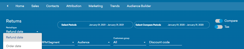
- At the top of the Homepage, you'll observe the navigation tabs
- Select Category: Sales
- Select Subcategory: Sales Performance
- Scroll down to the Returns Dashboard
Returns Overview & Dashboard Purpose
Improving your returns performance (especially if your sector has a higher returns rate eg fashion) should be part of your regular business performance review process so that you factor the impact of your improved returns performance into your growth strategy.
In a recent survey over 80% of customers stated that they would actively consider turning to brands that have better returns services and policies. You can use the data in this dashboard to deliver insights to you merchandising, operations and customer service teams to improve your performance. You can also use this data to create cohorts in Audience Builder based on returns behaviour for marketing campaigns to increase lifetime value from returning customers or generate a sale from a 100% returner.
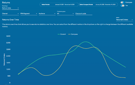
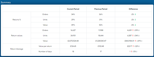
You can easily compare returns behaviour over different time periods using the date picker. Review your data weekly and monthly to spot trends and take action quickly to eg reduce the returns rate by improving product imagery and copy or improving the customer service communications and experience for product returners.
Use a combination of the Returns Summary data with the Returns Over Time chart to monitor your performance at topline and at cohort level
These charts summarise:
- The total number of returns processed within a specific period
- The total value of returns processed within a specific period
- The significance of the return in relation to the entire order


Improve Returns Rates by using Cohorts Analysis

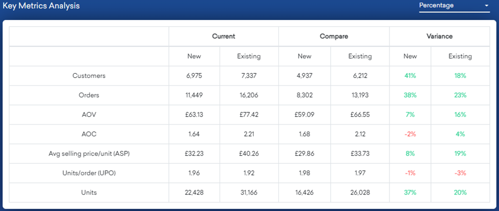
Whilst it is useful to see your topline returns trends, it is easier to improve returns rates by reviewing performance by different cohorts eg online versus in store, product or category level, new versus existing customers, champions versus lapsed customers, promo code redemptions etc. The filters are at the top of the dashboard as shown here.
You can also create any bespoke cohorts combining any blend of customer productivity, demographic, product and channel touchpoint data available and select them via Audience Filter.
You can provide detailed performance insights to your product, merchandising and operations teams but you can also use this data to recommend marketing campaigns to drive replacement and exchange activity.
Use a combination of the Returns Summary data with the Returns Over Time chart to monitor your performance at topline and at cohort level.
The value of a returning customer versus eg a prospect who has not yet converted is significant given the engagement they have already had with you. You have the opportunity to rescue a first-time customer returning with replacement or exchange product.
View Returns Behaviour in Other Dashboards
Monitor the value of your returning customers by creating them in Audience Builder and monitoring their lifetime value in the retention dashboard selecting Audience Filter as shown in the example or view their productivity in Sales Insights.
- View Returns Customers in Retention Dashboards

2 View Returns Customers in Sales Insights Dashboard select via Audience filter your Returners Cohort

3 View the gap to second purchase from these returning cohorts
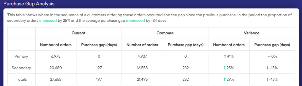
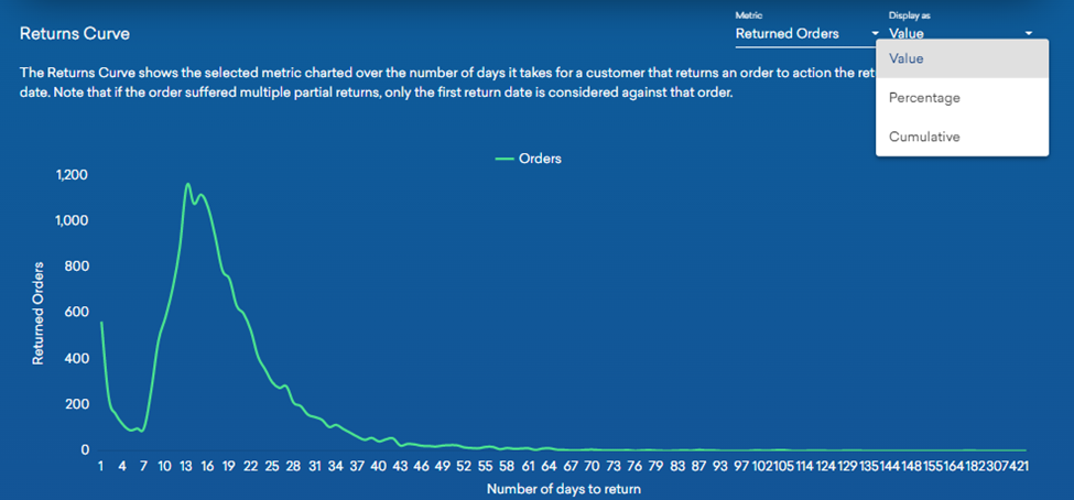
Returns Curve
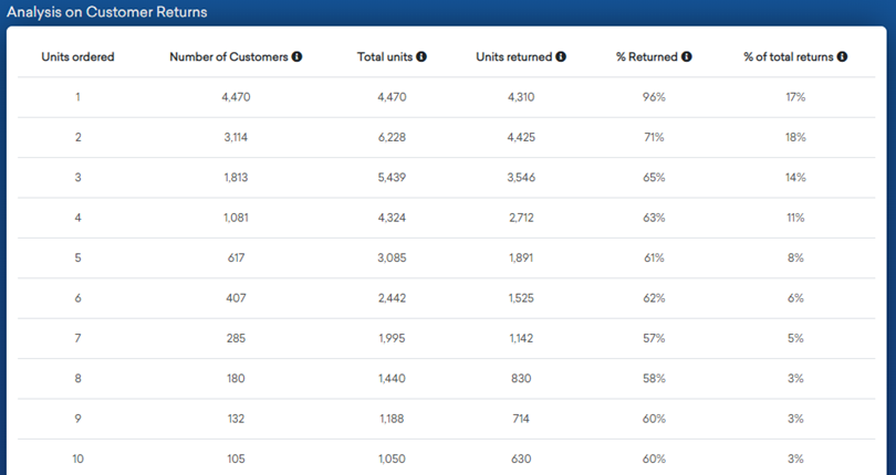
Take a look at your highest returners, they may be some of your best customers because they buy and return frequently but also keep a good proportion of their purchase. Or take a look at returns rate by units per order quantities as in this dashboard:
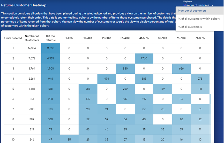
The returns heat map below will give you further visibility of returns behaviour during the selected period of those who have completely or partially returned orders. In the example below you see the volume and value of returns over time at total or customer cohort level. For example 11,333 or 79% of customers ordering one unit only have kept the item, 21% have returned during the time period. One unit orderers who kept their item represent 35% mix of all customers during the time selected and one unit orderers who returned that item represent 95 of all customers during the reporting period.
With these two charts you can see where customers are ordering multiple items and returning a high percentage look further into which products are being as they might be unsure about sizing if eg buying clothes. You can then retarget those customers specifically with size help.
What can you do to make your returns process frictionless? What is the impact of offering free returns? In a recent survey it was reported that 80% of customers expect free returns. It’s hard to predict the impact on your business unless you test it. Review your average order bands to set the threshold for free returns and monitor the results.
How quickly do customers return product? What is the customer service experience over this time period to process a return and encourage replacement or exchange activity? You can review the returns curve by order date or return date in the chart below:
Summary
The average returns rate in the UK is between 20% to 30% with the main reasons being fit issues, unwanted gift, multiple sizes ordered or disappointment with product. Make sure you capture returns reasons codes to supplement your dashboard analysis.
Don’t view returns solely as a cost to your business. Reframe your thinking to include the added value and loyalty that returning customers contribute to your business by making it to easy to buy, return and exchange product.