It only takes a minute to check your Sweet homepage dashboard to give you all your topline performance metrics at a glance. Access last week’s trading stats including Sunday by 9am on the Monday morning.
The tracker update on the homepage will also flag any syncing, integration, tracking issues up front so your reporting is up to date.
Choose your date range from this week and this month options, last week and last month options to last 7 or 30 day options. Compare to previous period or previous year.
 Select time and compare period


Red icon if there is an issue with data
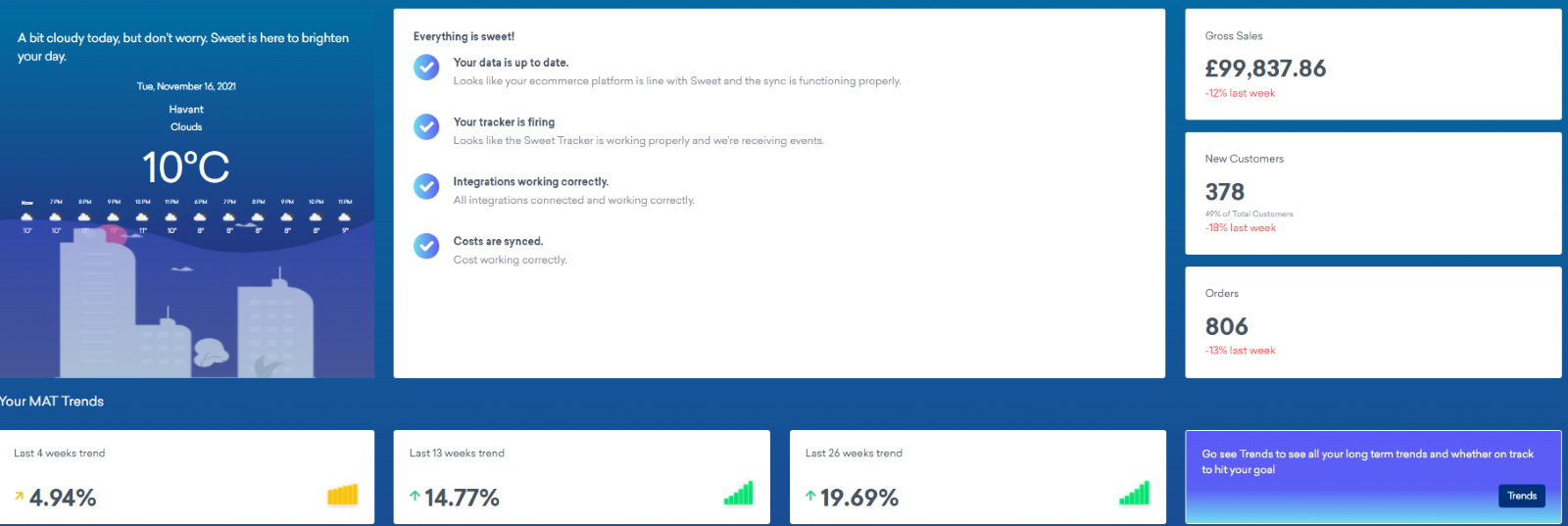
Variance analysis on sales, customers and orders shown in red or green to highlight negative or positive trends versus previous period or previous year. The example here compares to the previous period last week.
Whilst last week’s sales are down by 12%, the 4 weeks trend is slightly more positive at 5% up.
The MAT Trends is a moving annual sales total across 52 weeks. Click through to the Trends button to also see orders MAT trends by 4, 13 and 26 weeks and input your sales and customer goals to see how long it will take you to reach target.
The next section below summarises the gross £’s (or relevant currency) variance amount to the compare period.
You will also see here the gross sales (or net if that is your default reporting?) for the reporting period split across new and existing customers. So the example here shows that 45% mix of sales are coming from new customers but that £44,848 is 17% down on the compare period.
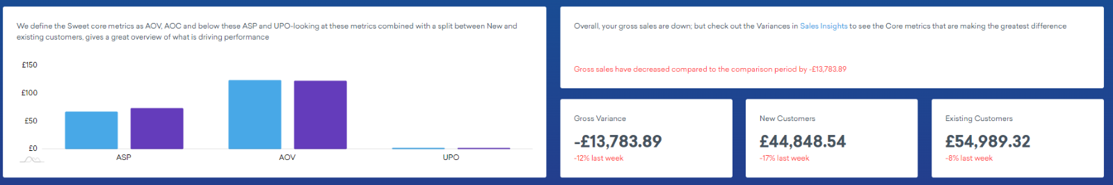
Average order value is made up of average selling price x units per order so the chart on the left hand side shows these difference between new and existing core metrics for the reporting period.
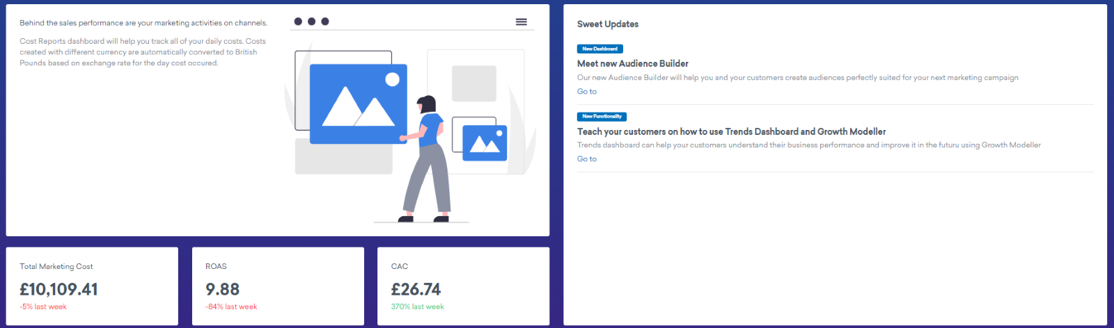
Finally on the left hand side of the dashboard, marketing costs are pulled into the performance overview. Costs are compared to the reporting period and assuming you have input all relevant marketing costs consistently you will then be able to see return on ad spend (ROAS) for the week by dividing total marketing costs into gross sales versus the comparison period. The same for the customer acquisition cost (CAC) by dividing total marketing costs by the number of new customers in the reporting period. Variance metrics are again show in red and green to highlight negative or positive trends.
In less than a minute, view sales, customers and marketing costs in one dashboard to give you and your team a red, amber, green flag in terms of performance. You can then focus your efforts based on what the data is telling you on what to do next to meet your goals.
Watch out for Sweet updates on platform or new functionality to get even more out of your dashboards.